Out with the old and in with the new
I know I do web design and development as a hobby, but I still want this site to look good, even if I end up being the only one that reads it. And I’ll be honest, I HATED my last version. So much that I just stopped using it. Well, time for that to change (I hope!).
I’ve created a new site design, which stays true to what I’ve wanted all along.
- Clean and simple design
- Use as little CSS as possible
- Don’t have a heavy framework and rely on my own code
- Use new (well to me anyways) CSS techniques
For the most part I think I’ve succeeded.
Creating a new design
Back to basics. I’m a hobby webdesigner after all. That’s what I told myself. The last site had all manner of fun bits of code found from Freefrontend. Don’t get me wrong, love the site. Just picking link styles, picture layouts etc from it ‘because I like it’, led to a bit of an eyesore last time.
So this time I kept things simple. Just basic hovers on links, working hard to get font size and layout spacing feel right and not using a framework which I would constantly fight against.
Simple CSS
For an age I’ve used a css framework for my sites, saves me trying to figure out hacks and also to get things like grid systems and good page flow of spacing etc. After messing with a few in this refresh I settled for Simple CSS.
For me the benefits were:
- minimal css
- not very opiniated in terms of colours, buttons, links etc
- meaning I didn’t spend an age fighting it with resets or figuring out what it was doing.
Very much recommend.
Light and dark modes
So where did variables in root come in? Either that was beyond my comprehension or not about the last time I was doing this. Just sass variables to keep code in order but not for making the site more flexible when live.
I’ve documented how it’s employed on this site for now, using the user agent settings. This is where it’s looking to see if you’ve set your browser to light, dark or system default, which would change based on time of day typically.
Massive shout out to Kevin Powell who has some really helpful tutorials to follow for web design and development in general, not just the ones I followed for enabling light and dark themes on this site.
Setting your root variables to use
This makes so much sense, making the variables accessible to the actual site to employ where it needs. Rather than my old jekyll site which essentially had a variable used in the build, but once deployed just had a static attribute which wasn’t changeable.
Setting the variables nice and easy in the a root section.
/* Global variables. */
:root,
::backdrop {
  /* Default (light) theme */
  --bg: #fff;
  --accent-bg: #f5f7ff;
  --text: #212121;
  --text-light: #585858;
  --border: #898EA4;
  --accent: #0d47a1;
  --accent-hover: #1266e2;
  --accent-text: var(--bg);
}
Using them in your css
Here’s how I used them in some of the css later in the file for reference.
body {
  color: var(--text);
  background-color: var(--bg);
  font-size: 1.15rem;
  line-height: 1.5;
  display: grid;
  grid-template-columns: 1fr calc(min(45rem, 90%)) 1fr;
  margin: 0;
}
resetting them for dark mode
Then when it came to dark scheme, just one simple media query after the root section to reset the variables. Happy days.
/* Dark theme */
@media (prefers-color-scheme: dark) {
  :root,
  ::backdrop {
    color-scheme: dark;
    --bg: #212121;
    --accent-bg: #2b2b2b;
    --text: #dcdcdc;
    --text-light: #ababab;
    --accent: #ffb300;
    --accent-hover: #ffe099;
    --accent-text: var(--bg);
  }
}
Fun features
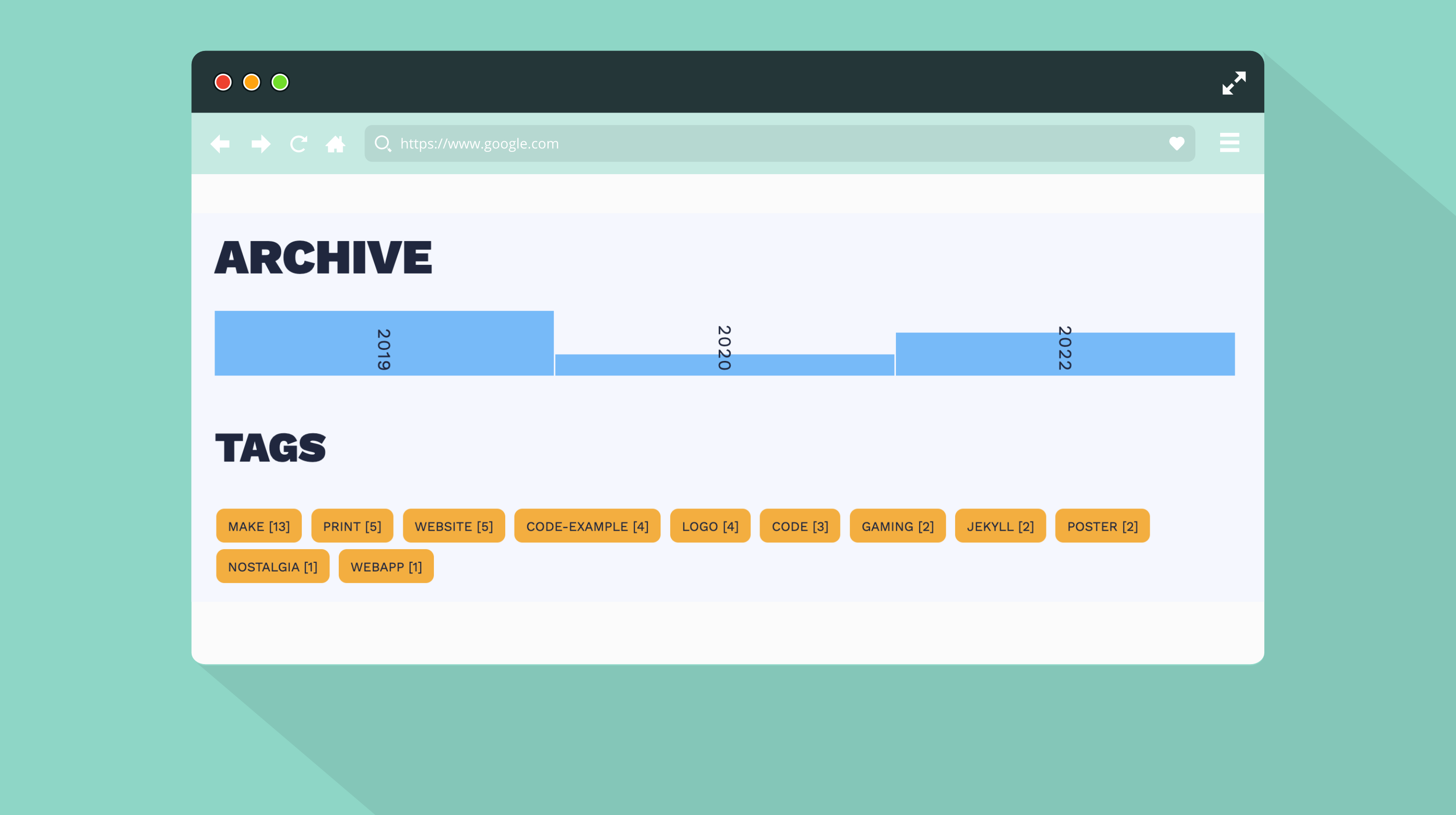
Two other features for the blog I’m glad I’ve figured out are having some more complex for loops (this site is built using jekyll) and having a chart showing blog posts made each year.
What this has done is make a more engaging archives page.
For loop to split out posts
This simple piece of code loops through your posts and for each year that has posts in, it’ll create a block with the year as the title.
As an FYI, my include article-list-item.html is my article code for all my archive, home and tag pages. Saves me having to update the code in multiple pages!
<div class="content-limiter">
  {%- assign years = site.posts | group_by_exp:"posts", "posts.date | date: '%Y'" -%}
  {%- for year in years -%}
  <div class="timeline-year">
    <div>
      <h2>{{year.name}}</h2>
      {%- if {{year.size}} == 1 -%}
        <h5>{{year.size}} Post</h5>
      {%- else -%}
        <h5>{{year.size}} Posts</h5>
      {%- endif -%}
    </div>

  {%- for posts in year.items -%}
      {%- include article-list-item.html -%}
  {%- endfor -%}
  </div>
  {%- endfor -%}
</div>
A graph for blog posts per year
This is one had lots of head scratching. Not one to take credit for the idea, it was copied from Dave Rupert’s Blog.
Using the power of jekyll loops, I was able to recreate the chart dynamically, creating a div per year inside the main div of ‘chart’. I was also able to apply some inline css to each column so, with the right css applied, it spanned a height relative to the other years.
Full disclaimer, this is working now - who knows if I got this right. It was trial and error so I’m fully expecting to see an edge case not work in the future. But here’s hoping.
<!-- column for each year in posts -->
{%- assign years = site.posts | group_by_exp:"posts", "posts.date | date: '%Y'" -%}

{%- assign max-year = 0 -%}
{%- for year in years -%}
    {%- if {{year.size}} > {{max-year}} -%}
        {%- assign max-year = year.size -%}
    {%- endif -%}
{%- endfor -%}

<div class="chart">
    {%- for year in years reversed -%}
    {%- assign grid-row = max-year | minus:{{year.size}} | plus:1 -%}
    <div class="bar" data-value=" {{year.size}}" style="grid-row: {{grid-row}} / span {{year.size}}; grid-column:{{forloop.index}};">
        <span>
            <p>{{year.name}}</p>
        </span>
    </div>
{%- endfor -%}
</div>
The CSS used for the chart.
//chart

.chart {
    display: grid;
    gap: 0 0.1rem;
    align-items: end;
    margin: 2rem 0 0;
    padding: 0;
    max-height: 4rem;
    max-width: 100%;
    flex-direction: column-reverse;
    grid-auto-columns: 1fr;
    grid-auto-rows: minmax(0, 1fr)
}
.bar {
    writing-mode: tb;
    align-items: end;
    justify-content: space-between;
    color: var(--text);
    background: var(--accent-hover);
    height: 100%;
    display: flex;
    flex-direction: column-reverse;
    font-size: 0.86rem;
    height: 100%;
    justify-content: center;
    padding: 0.25rem 0;
    > span > p {
        margin: 0 !important;
    }
}
Whats next?
Well, the main one is post more. I’m constantly tinkering with raspberry pi’s, my 3d printer and many other bits of tech, so I should write down what I’ve managed to figure out. Never know, might be of use to others who stumble upon this blog.
For the site, I still have one more feature to implement which would be a light / dark mode toggle to extend what I’ve done already.
Suppose on both counts I best get cracking.
The Archives